Thursday, April 28, 2011

Another Semester


Another semester of school is coming to an end and yes one more to go. It is funny to think that there really is an end to my "student career". I have often chuckled thinking about all the very late nights (or I guess you could say very early mornings) and countless hours of staying in front of my computer, diligently working on various assignments, trying to meet desired looks, concepts, ideas and deadlines...I am now starting to see that my diligence is paying off.

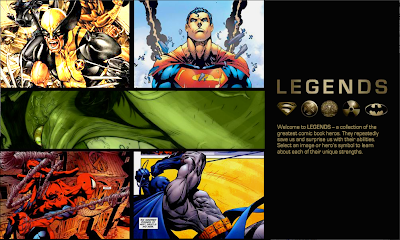
I started putting together my printed portfolio. When I see everything I have finished I am happy to know I've accomplished some good things. Here are some of the works from my portfolio. I realize there are still many things for me to learn in order to be a good designer, but I feel that I understood some good concepts and applied them to my work.

Here are some pics/jpgs of what I have placed in my portfolio this symester. I realize that some pics or ideas have already been posted in the past but there are those that have been updated or change. And I thought that it would be nice to see them all together anyway.

Monday, January 17, 2011

Different look for background


Just trying some different lighting for the background.

Wednesday, January 12, 2011

Idea For Recording Studio logo


So its not finished but I like it. This is an idea for a small recording business/studio that my buddy has. The O in ROCK (which is his last name) has been turned into a symbol for both sound waves and an illuminated record/CD. His business obviously deals with recording, but it also offers customers to experience good sound by giving them an opportunity to rent his equipment for weddings, dances or events at a reasonable price.

Saturday, December 25, 2010

My Nephew


So I've been waiting awhile to put this one up. This is a portrait of my awesome little nephew. I gave this to my sister for a Christmas gift tonight. I didn't want to put it on here until she received it. My nephew is the cutest kid ever!

Saturday, December 11, 2010

Painting


Here are two paintings that I did for my painting class. I have so much to learn about painting. It truly is a Fine Art.

Friday, December 10, 2010

Branding Dowtown Logan

In my branding class we were placed in groups and given an opportunity to work with the Downtown Alliance in Logan. They were looking for propositions on what a NEW Downtown Logan could look like, how to bring traffic into downtown, and ways to let the community know of upcoming events, and symbol to represent downtown. Here are some of the idea our group came up with:

Our vortex or anchor idea was a continued Learning Center. It would be like a Rec Center where people could rock climb or dance but it would also have classes offered to the community like painting, drawing, cooking etc. Having a center like this would be great for bringing traffic to the downtown area.


This is our logo for Downtown Logan. We went with an identifiable symbol of the downtown area. These lamp posts are all along the streets of Downtown Logan. The tagline of the logo says "cultivating opportunity". Logan has a lot to offer and has a lot of potential. It is a cultivating town. We wanted the new Downtown area to also show opportunity. Light has a lot of good baggage that comes with it. The logo relates to our vortex or anchor. Education often symbolized by the use of light or light is often equated to learning.


This is an example of how we wanted our stores to look. The picture of the building in blue is literally one of the stores that is located in the downtown area. The pic beneath it is our version of what it should look like. We thought that downtown needed anchor stores that would bring bring people in more often to the downtown area. The store would still have the historical feel or structural integrity of the downtown area while having also a new fresh look.


These are the event posters that we came up with. We proposed that the posters would be placed on the light posts. Right now, downtown only has place holders that are in the dark and away from light posts that the Downtown Alliance spent a lot of money on. We thought it would be good to show them the event banners on their posts. I'm proud to say that two of these are my designs. The opera mask and the biker.

Thursday, December 9, 2010

Working with Flash


This is the home page for a site that I did in Flash for my Graphic Interface class. Flash is cool and I'd like to work more with it to get better. Anyway I put together a site that included the "legends" of the of superhero's. Check it out. Here is the link or you can click the pic.

http://www.fall10.graphicinterfacedesign.com/students/bfinch/flash/

Friday, November 5, 2010

Abstract company mark


This mark is for a venture capitalist company. It is called provenance. (Not a real company) So we needed to come up with an abstract symbol that encompasses many other small businesses. The company was supposed to be in stationed in California. The name Provenance hints at, birthplace, creation, arising; coming to light, bringing forth, giving life, etc. As a company they wanted to be perceived as powerful, supportive, innovative, precise, stealth, intelligent, measured risk-takers and stable. I think I represented those adjectives.

Boo! at the zoo


This was for coming up with a brand that would show the on goings of a Zoo event. The idea was to mix Halloween and showing the varies zoo animals in one mark. So I went with the idea of Jack-o-lanterns. Inside of the center pumpkin you can see a cut out of an angry gorilla.

Chimera


We were supposed to come up with a mock company and try to create a word mark for it. Based off of the adjectives that we used to describe our company this is what I drew. It is really hard to hand draw your own font. I have a lot of respect for coca-cola. That's how they started with theirs.