Wednesday, September 22, 2010

Making A Fixed Body Background On Dreamweaver

This tutorial will show you how to create a “fixed” background once you have already placed an image in Dreamweaver. A fixed background is used when you want your content or text of your page to scroll but have background image stay in place. This tutorial also shows how to position that fixed image at the top of your screen and center it. So, when you scroll on your browser the content will move but the background will stay put. And when you scale your website on another browser, the background stays centered with it.


View end result in action:

You will need the Dreamweaver program. This takes no more than few minutes to follow step by step, but once you know which buttons to push, it will take no more than seconds.


Step 1:

Once you have placed your image in Dreamweaver using the page properties button you will go to CSS Styles panel. If the panel is not open or doesn’t show on your screen you can simply go to Window> CSS Styles.


The box will appear in the upper right corner in Dreamweaver. The tab will say “CSS styles”


Step 2:

Select “body” inside of the CSS Styles box. This is simply done by double clicking on it.


After double clicking “body” another box will appear that says, “CSS rule definition for body” at the top of the box.


Step 3:

In the “CSS rule definition for body” box select the word “background” located on the left side of the box.


You will notice that your image info for your background image is already there as well as a background color.


Step 4:

In the option that says, “background-attachment”, select the word “fixed”.


This is what allows the picture of the background to stay where it is while having the rest of your content or text able to scroll.

Step 5:

Now select the “background-position (x)” to “center.” Then press Apply.


You’ll notice that your background image has been moved and centered.


Step 6:

Lastly select “background-position (Y)” and choose “top”. And click apply again.


This changes the vertical position of your image. In this case selecting “top” makes sure that your background image will be located at the top of the page.


Step 7:

Once all of these options have been chosen, go ahead and click ok.


Congratulations!

What you’ve created is a background image that is centered starting at the top of your screen and will always be “fixed”. So, when you scale on another browser, the background stays centered with it. And when you scroll the content will move but the background will stay put.

About this tutorial:

I got this information and mini clip from Lynda.com, this site can teach you a lot of things. Check it out! www.lynda.com

Sunday, September 12, 2010

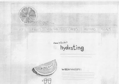
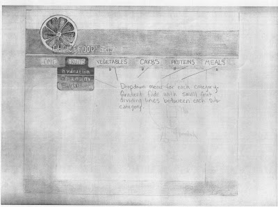
Roughs for HTML website


These are my rough drafts for a food website that I'm planning to put together. The site content will be about the benefits of eating certain types of food. The categories of the site will be broken down into fruits, vegetables carbohydrates, proteins, and meals. Each of these categories would be broken up into subcategories such as hydrating, cleansing, weight loss...etc.

Wednesday, September 1, 2010

Site critique

Site Critique
flash: http://www.mono-1.com/monoface/main.html
html: http://www.nationalgeographic.com/

The National Geographic’s website is what I chose to critique. What makes this site successful is it’s content. There is something for everyone who wants to learn. Whether you like animals, history, daily news, maps, games, science or traveling you are going to find information with beautiful pictures on this site. The background isn’t busy or overwhelming and the type is all san serif, which is an easier read for your eye. The beautiful photography that appears under the sites main categories helps give interest to the site.

At the top of the home page there is a strip of black that contrasts with the rest of the white background of the site’s page. This brings the viewer’s eye to the different categories of the site. Not only does the contrasting colors of the site’s background create focus, but the lettering of the categories is either in white or yellow, which goes great against the top black area and creates even more focus on the categories. This allows the user of the site to easily find categories and navigate through the site quickly.

Simply hovering over a main category with your mouse will bring up more specific subcategories to choose from. And from one page to another the layout mostly stays the same. The top always remains with the original categories wherever you go so that you can navigate quickly to somewhere else. The only things that change are the pictures that deal with the categories you choose and there are subtle gradient changes to backgrounds, other than that you can see basically the same “rule of thirds through each of the pages.”

There is both a visual and informational hierarchy. The largest at most interesting pictures along with the most important or most sought after info is at the top and then it goes smaller as you work your way down the page.

This site allows its user to be both informed and entertained with its information, photo’s, videos and games. From child to adult this site can work for the general population who want to know more.

Looking at the layout of this page allows me to have some ideas for when I create my own web page. I’d like to have elements that help lead the users eye to places where they can navigate easily. Keep things uniform or try to keep the layout the same or similar from page to page. It is also important to have elements that keep the user interested and entertained without overwhelming them. I’m still not sure as to what subject or site I’m going to make, but applying these elements should help me have a better user-friendly site.