Saturday, December 25, 2010

My Nephew


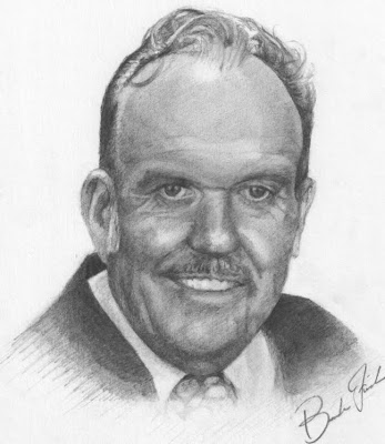
So I've been waiting awhile to put this one up. This is a portrait of my awesome little nephew. I gave this to my sister for a Christmas gift tonight. I didn't want to put it on here until she received it. My nephew is the cutest kid ever!

Saturday, December 11, 2010

Painting


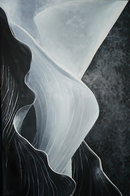
Here are two paintings that I did for my painting class. I have so much to learn about painting. It truly is a Fine Art.

Friday, December 10, 2010

Branding Dowtown Logan

In my branding class we were placed in groups and given an opportunity to work with the Downtown Alliance in Logan. They were looking for propositions on what a NEW Downtown Logan could look like, how to bring traffic into downtown, and ways to let the community know of upcoming events, and symbol to represent downtown. Here are some of the idea our group came up with:

Our vortex or anchor idea was a continued Learning Center. It would be like a Rec Center where people could rock climb or dance but it would also have classes offered to the community like painting, drawing, cooking etc. Having a center like this would be great for bringing traffic to the downtown area.


This is our logo for Downtown Logan. We went with an identifiable symbol of the downtown area. These lamp posts are all along the streets of Downtown Logan. The tagline of the logo says "cultivating opportunity". Logan has a lot to offer and has a lot of potential. It is a cultivating town. We wanted the new Downtown area to also show opportunity. Light has a lot of good baggage that comes with it. The logo relates to our vortex or anchor. Education often symbolized by the use of light or light is often equated to learning.


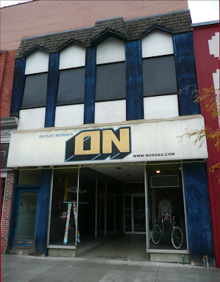
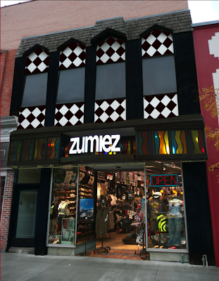
This is an example of how we wanted our stores to look. The picture of the building in blue is literally one of the stores that is located in the downtown area. The pic beneath it is our version of what it should look like. We thought that downtown needed anchor stores that would bring bring people in more often to the downtown area. The store would still have the historical feel or structural integrity of the downtown area while having also a new fresh look.


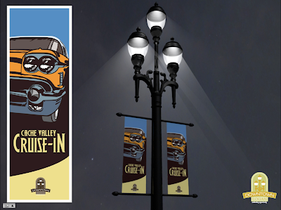
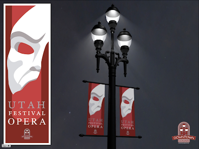
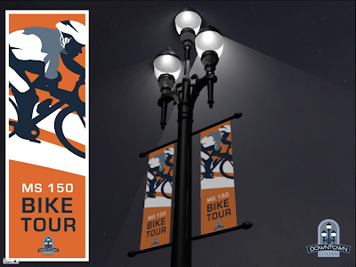
These are the event posters that we came up with. We proposed that the posters would be placed on the light posts. Right now, downtown only has place holders that are in the dark and away from light posts that the Downtown Alliance spent a lot of money on. We thought it would be good to show them the event banners on their posts. I'm proud to say that two of these are my designs. The opera mask and the biker.
Thursday, December 9, 2010

Working with Flash


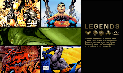
This is the home page for a site that I did in Flash for my Graphic Interface class. Flash is cool and I'd like to work more with it to get better. Anyway I put together a site that included the "legends" of the of superhero's. Check it out. Here is the link or you can click the pic.

http://www.fall10.graphicinterfacedesign.com/students/bfinch/flash/

Friday, November 5, 2010

Abstract company mark


This mark is for a venture capitalist company. It is called provenance. (Not a real company) So we needed to come up with an abstract symbol that encompasses many other small businesses. The company was supposed to be in stationed in California. The name Provenance hints at, birthplace, creation, arising; coming to light, bringing forth, giving life, etc. As a company they wanted to be perceived as powerful, supportive, innovative, precise, stealth, intelligent, measured risk-takers and stable. I think I represented those adjectives.

Boo! at the zoo


This was for coming up with a brand that would show the on goings of a Zoo event. The idea was to mix Halloween and showing the varies zoo animals in one mark. So I went with the idea of Jack-o-lanterns. Inside of the center pumpkin you can see a cut out of an angry gorilla.

Chimera


We were supposed to come up with a mock company and try to create a word mark for it. Based off of the adjectives that we used to describe our company this is what I drew. It is really hard to hand draw your own font. I have a lot of respect for coca-cola. That's how they started with theirs.

final raccoon


I decided to take out the raccoon's foot to avoid confusion as to what is there. In my critique my teacher suggested pushing the circular shape of the raccoon more. So I'll have to give that a shot.

animal assignment


This is something I drew for an assignment in Brand and Identity. The project was to abstract and stylize a zoo animal using Adobe Illustrator. I chose a raccoon.

Thursday, November 4, 2010

Flash animation

Here is what it looks like. You'll have to move the right side of your browser over. Here is the link.
www.fall10.graphicinterfacedesign.com/students/bfinch/anim/index.html

Tuesday, November 2, 2010

Sherlock poster


Here is my poster that I'm going to use for my animation assignment.

Website


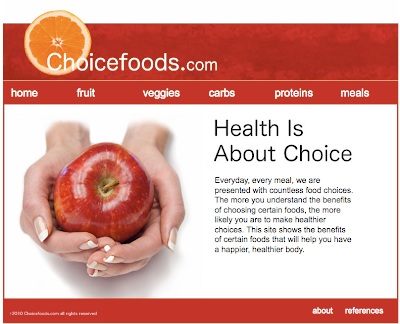
So my website is up. Check it out. http://www.fall10.graphicinterfacedesign.com/students/bfinch/html/choicefoods/

Wednesday, September 22, 2010

Making A Fixed Body Background On Dreamweaver

This tutorial will show you how to create a “fixed” background once you have already placed an image in Dreamweaver. A fixed background is used when you want your content or text of your page to scroll but have background image stay in place. This tutorial also shows how to position that fixed image at the top of your screen and center it. So, when you scroll on your browser the content will move but the background will stay put. And when you scale your website on another browser, the background stays centered with it.


View end result in action:

You will need the Dreamweaver program. This takes no more than few minutes to follow step by step, but once you know which buttons to push, it will take no more than seconds.


Step 1:

Once you have placed your image in Dreamweaver using the page properties button you will go to CSS Styles panel. If the panel is not open or doesn’t show on your screen you can simply go to Window> CSS Styles.


The box will appear in the upper right corner in Dreamweaver. The tab will say “CSS styles”


Step 2:

Select “body” inside of the CSS Styles box. This is simply done by double clicking on it.


After double clicking “body” another box will appear that says, “CSS rule definition for body” at the top of the box.


Step 3:

In the “CSS rule definition for body” box select the word “background” located on the left side of the box.


You will notice that your image info for your background image is already there as well as a background color.


Step 4:

In the option that says, “background-attachment”, select the word “fixed”.


This is what allows the picture of the background to stay where it is while having the rest of your content or text able to scroll.

Step 5:

Now select the “background-position (x)” to “center.” Then press Apply.


You’ll notice that your background image has been moved and centered.


Step 6:

Lastly select “background-position (Y)” and choose “top”. And click apply again.


This changes the vertical position of your image. In this case selecting “top” makes sure that your background image will be located at the top of the page.


Step 7:

Once all of these options have been chosen, go ahead and click ok.


Congratulations!

What you’ve created is a background image that is centered starting at the top of your screen and will always be “fixed”. So, when you scale on another browser, the background stays centered with it. And when you scroll the content will move but the background will stay put.

About this tutorial:

I got this information and mini clip from Lynda.com, this site can teach you a lot of things. Check it out! www.lynda.com
Sunday, September 12, 2010

Roughs for HTML website


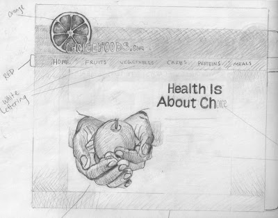
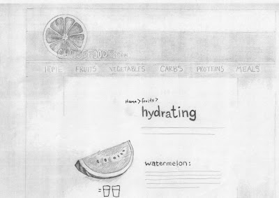
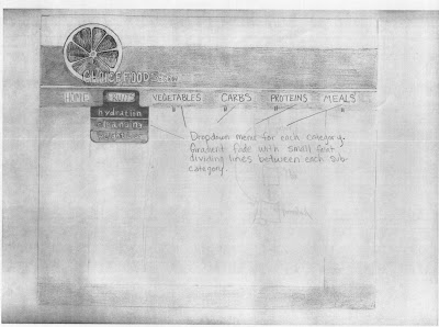
These are my rough drafts for a food website that I'm planning to put together. The site content will be about the benefits of eating certain types of food. The categories of the site will be broken down into fruits, vegetables carbohydrates, proteins, and meals. Each of these categories would be broken up into subcategories such as hydrating, cleansing, weight loss...etc.

Wednesday, September 1, 2010

Site critique

Site Critique
flash: http://www.mono-1.com/monoface/main.html
html: http://www.nationalgeographic.com/

The National Geographic’s website is what I chose to critique. What makes this site successful is it’s content. There is something for everyone who wants to learn. Whether you like animals, history, daily news, maps, games, science or traveling you are going to find information with beautiful pictures on this site. The background isn’t busy or overwhelming and the type is all san serif, which is an easier read for your eye. The beautiful photography that appears under the sites main categories helps give interest to the site.

At the top of the home page there is a strip of black that contrasts with the rest of the white background of the site’s page. This brings the viewer’s eye to the different categories of the site. Not only does the contrasting colors of the site’s background create focus, but the lettering of the categories is either in white or yellow, which goes great against the top black area and creates even more focus on the categories. This allows the user of the site to easily find categories and navigate through the site quickly.

Simply hovering over a main category with your mouse will bring up more specific subcategories to choose from. And from one page to another the layout mostly stays the same. The top always remains with the original categories wherever you go so that you can navigate quickly to somewhere else. The only things that change are the pictures that deal with the categories you choose and there are subtle gradient changes to backgrounds, other than that you can see basically the same “rule of thirds through each of the pages.”

There is both a visual and informational hierarchy. The largest at most interesting pictures along with the most important or most sought after info is at the top and then it goes smaller as you work your way down the page.

This site allows its user to be both informed and entertained with its information, photo’s, videos and games. From child to adult this site can work for the general population who want to know more.

Looking at the layout of this page allows me to have some ideas for when I create my own web page. I’d like to have elements that help lead the users eye to places where they can navigate easily. Keep things uniform or try to keep the layout the same or similar from page to page. It is also important to have elements that keep the user interested and entertained without overwhelming them. I’m still not sure as to what subject or site I’m going to make, but applying these elements should help me have a better user-friendly site.

Saturday, August 7, 2010

HULK SMASH!!!


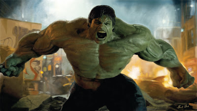
Sometimes you have those days when you get angry and you want to break something...I love the HULK! This is a PAINTING from a scene from the movie, I did this in photoshop ONLY USING THE PAINTBRUSH TOOL (and layers). I'm pretty happy with it, the artist in me always says there is more that could be done, but I think it's good enough to post. Take a look at the strokes by clicking on the image. Enjoy!

Wednesday, July 14, 2010

SLCC little label


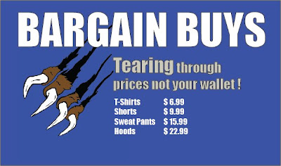
So I was able to put this together very quickly in a tight pinch. I work for the SLCC bookstore, and they needed a little label or display sign for some clothes. SLCC's mascott is a bruin, so, I like the creativeness of the phrase to go with the imagery of the bear claw slashing or "tearing" through the background. If I had more time I think it would look awesome.

Thursday, May 27, 2010

MADE MY OWN BLOG BACKGROUND!


This something I put together. I always wanted to do my own blog background instead of taking a template from a free site or something. So now, even the background of my blog is art that is done by me.

Tuesday, May 18, 2010

Grandpa Finch


Well summer is here and I'm happy to report I have still done some art to start it off. This is a drawing of my Grandpa Finch. It was a little difficult for me because I was working from a very small, fuzzy obituary pic out of a newspaper and the values on it were hard to work with or make out. It was fun to do.

Wednesday, April 28, 2010

Poster


This is my Helvetica poster. In my type class we were supposed to pick a font, represent it visually, give a brief history on it and display what the letters and symbols looked like in that font style.

Tuesday, April 13, 2010

TRIFOLD BROCHURE


Paintball! I did this brochure for my typography class. I thought it would be fun to do it on paintballing. There were lots of little things to fix on it. It finally turned out great. Hope you enjoy!

Wednesday, April 7, 2010

Working with a spread


This assignment was knowing how to use a grid system to come up with a good spread. We could only use certain pictures so i feel that its a little boring. It's good though.

Playing with Words


Past assignment: These are words that I tried to represent visually.


I forgot to put these up. They are just some assignments dealing with paragraph use and text. The assignment was to show how to distinguish different paragraphs in unique ways.

Friday, March 26, 2010

PAINTING


This is an enlarge-to-abstraction of a Calla Lily that I painted with oils. I did it for my buddy Matt Keyes and his wife Cassie. They are so great and fun to be around! They wanted a piece of art work to go in their downstairs and so here it is. Having such a large piece made it difficult for me to paint quickly and school made it hard for me to find time to work on it. Thankfully Spring Break gave me the time to put more brush strokes down and finish it up. Like I always say..."I worked really hard on it". I'd like to think my oil painting skills have developed a bit and are becoming better.